Product Preview
Build your design system in minutes, not months
From color palettes to component tokens, from typography to full documentation — all in one tool. Export to Figma, ship to your project.
Designry turns a single primary color into a complete, production-ready design system — including colors, typography, spacing, and tokens, all ready to export to Figma, Tailwind, or your codebase.
Build your full design system: colors, type, spacing, components. Export to CSS, Figma, and Tailwind — all at once.
You pick a blue, but you need a darker shade for the hover state. You have to adjust that manually, too. Then there’s a separate one for dark mode. In the end, none of them match.
You have to rethink the spacing system, radius values, and typography for every project. There are no standards, no consistency—just a waste of time.
You design something in Figma, but the developer uses different values. There are no tokens and you have to start from scratch on every project.
Designry generates a complete, consistent design system from your brand colors — and exports it to every tool and framework you already use.
A focused toolkit designed for the way modern product teams actually build design systems.
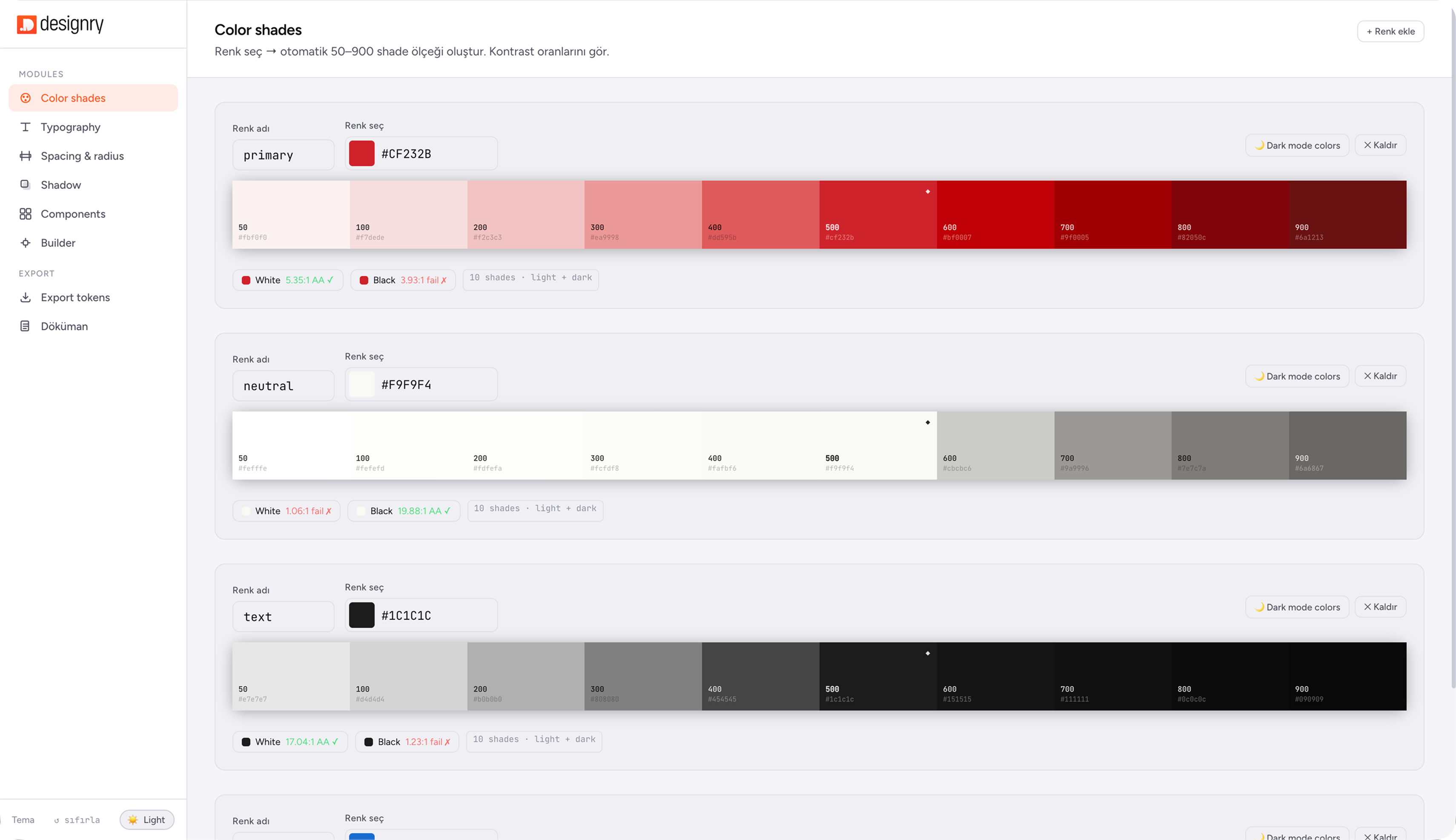
Generate perceptually accurate 50–900 color scales using OKLCH — with automatic dark mode palettes and WCAG contrast verification built in.
Choose from 80+ Google Fonts and build a modular type scale in seconds. Preview every size in real time, directly in your browser.
See your tokens come to life instantly. Buttons, inputs, cards and badges update in real time as you adjust colors, size and spacing.
Export to CSS Variables, Figma Variables, Tailwind Config and JSON — all from the same source of truth, in one click.
Pick your colors. Tune the system. Export the tokens. That's the whole workflow.
Enter your primary and secondary colors. DS Tool instantly generates a complete 50–900 color scale — with dark mode palette and WCAG contrast check included.
Adjust typography, spacing, radius and shadows with live controls. Every change reflects instantly in the component preview.
Copy CSS variables straight into your codebase, import Figma Variables into your design file, or paste Tailwind config directly into your project.
From color palettes to component tokens, from typography to full documentation — all in one tool. Export to Figma, ship to your project.
Whether you're a solo freelancer, a small agency, or an early-stage startup — Designry scales with the way you work.
Explore use casesLaunch your MVP with a cohesive visual language. No designers required.
Learn more →Colors, typography, spacing, components — all structured, exportable, and ready to hand off. Your team speaks the same visual language.
Learn more →CSS Variables, Tailwind config, and Figma Variables export — ready to drop into your codebase. No design background required to get started.
Learn more →Stop rebuilding from scratch for every client. Generate tokens and full documentation in minutes, not days.
Learn more →A side-by-side look at what changes when your system generates itself.
Start free. When you're ready, pay once and own it forever.
From colors to tokens, from components to documentation — everything generated, everything ready to export.